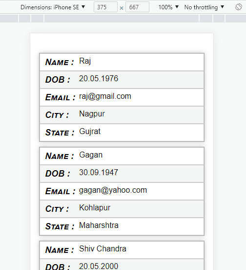
How to create a responsive table?
Table responsive using grid CSS:
For the responsive table in CSS, we need to create a table in HTML and write a CSS
for your table as looking. The main concept is “thead” display none in media query
for the mobile responsive. And our table display should be grid “display:grid;”.
When we required thead data then we need to use “nth-of-type” according to data sequence and we use “::before” property in CSS.

For more clarification see the code below:
HTML Code:
<div class="container">
<table class="tableResponsive">
<thead>
<tr>
<td>Name</td>
<td>DOB</td>
<td>Email</td>
<td>City</td>
<td>State</td>
</tr>
</thead>
<tbody>
<tr>
<td>Raj</td>
<td>20.05.1976</td>
<td>raj@gmail.com</td>
<td>Nagpur</td>
<td>Gujrat</td>
</tr>
<tr>
<td>Gagan</td>
<td>30.09.1947</td>
<td>gagan@yahoo.com</td>
<td>Kohlapur</td>
<td>Maharshtra</td>
</tr>
<tr>
<td>Shiv Chandra</td>
<td>20.05.2000</td>
<td>shivcha@gmail.com</td>
<td>Kochchi</td>
<td>Kerla</td>
</tr>
<tr>
<td>Ram Chandran</td>
<td>06.09.1932</td>
<td>ramchandra@gmail.com</td>
<td>Khalsa</td>
<td>Colkata</td>
</tr>
</tbody>
</table>
</div>
CSS Code:
.container{max-width: 800px; margin: 30px auto;}
.tableResponsive{
width: 100%;
border-collapse: collapse;
font: italic small-caps normal 16px/20px Arial, sans-serif;
}
.tableResponsive thead td{
font: italic small-caps bold 18px/24px Arial, sans-serif;
background: #0bf;
color: #fff;
}
.tableResponsive td{
font: normal 16px/20px Arial, sans-serif;
border: 1px solid #ccc;
padding: 5px 10px;
}
.tableResponsive tr:nth-child(even){
background: #f5f5f5;
}
@media (max-width: 767px) {
.tableResponsive thead {
display: none;
}
.tableResponsive tr{
display:grid;
border:1px solid #aaa;
box-shadow: 0 0 10px 0px #cccccc;
margin: 10px;
}
.tableResponsive tr:nth-child(even){
background: none;
}
.tableResponsive td:nth-child(even){
background: #f5f5f5;
}
.tableResponsive td:nth-of-type(1)::before { content: "Name :"; font: italic small-caps bold 18px/24px Arial, sans-serif; }
.tableResponsive td:nth-of-type(2)::before { content: "DOB :"; font: italic small-caps bold 18px/24px Arial, sans-serif;}
.tableResponsive td:nth-of-type(3)::before { content: "Email :"; font: italic small-caps bold 18px/24px Arial, sans-serif; }
.tableResponsive td:nth-of-type(4)::before { content: "City :"; font: italic small-caps bold 18px/24px Arial, sans-serif;}
.tableResponsive td:nth-of-type(5)::before { content: "State :"; font: italic small-caps bold 18px/24px Arial, sans-serif;}
.tableResponsive td:before{
float: left;
width:70px;
}
}

No comments:
Note: Only a member of this blog may post a comment.